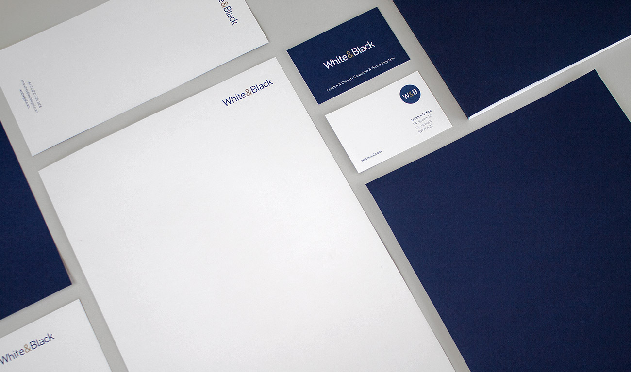
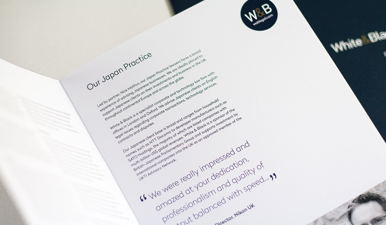
White & Black is a dynamic and award-winning, specialist technology law firm based in London and Oxford. Following considerable growth, the partners were looking for a subtle shift in their branding to reflect the firm’s reputation and growing, high-profile client list.
Brand re-alignment – evolution not revolution:
The brand re-alignment was deliberately evolutionary rather than revolutionary with detailed work on the logo type to deliver a more balanced and professional feel.
Careful choice of Pantone colours and print finishes to communicate professionalism:
This professional feel was carried through with the use of the Oxford Blue Pantone (202) and a Gold Metallic ink (871) with all print materials created on premium uncoated papers and boards.
In addition to new stationery items, brochures for each of their key practice areas and several other print items, we also designed and built their company website.
“Working with Jan and Caroline over the past few years has been a very happy and positive experience - they feel part of our W&B team. They are always very responsive and perceptive listeners – we are able to develop ideas together and engage in a productive, critical discussion. We are delighted with their work!”
We use cookies to ensure that we give you the best experience on our website. If you continue to use this site we will assume that you are happy with it.